A killer landing page is essential if you want to get that all important click! And to get that click, you need to attract and keep your reader’s attention for long enough to persuade them to take action!
So, if your landing page content doesn’t have the WOW factor, then the number of conversions will drop significantly.
To create the WOW factor, your visitors need to identify with your landing page. This means that you need to nail the emotion, offer, message and tone. Pay particular attention to your headline. According to Moz, 80% of readers never make it past the headline and traffic can vary by as much as 500% based on the headline.

So, what exactly is a landing page?
A landing page is essentially a standalone web page which you use to encourage your visitor to take a particular action. It could be buying a specific product or service or downloading your lead magnet
A landing page is successful if the user takes the specific desired action – or converts. And the more specific you are, the more likely you are to convert your prospects.
What are the different types of landing pages?
The most common types of landing pages are as follows:
- Sales Landing Page
- Lead Capture Landing Page
- Click Through Landing Page
- Squeeze Landing Page
- Event Landing Page
- Thank You Landing Page
Why do you need a landing page?
You need a landing page to drive conversions and nurture leads. A landing page should be clear with no distractions.
Landing pages are designed with a single focus or goal, known as a call-to-action (CTA). It’s this focus that makes landing pages the best option for supercharging the conversion rates of your marketing campaigns and lowering the costs of acquiring a lead or sale.
A killer landing page features great copy and design
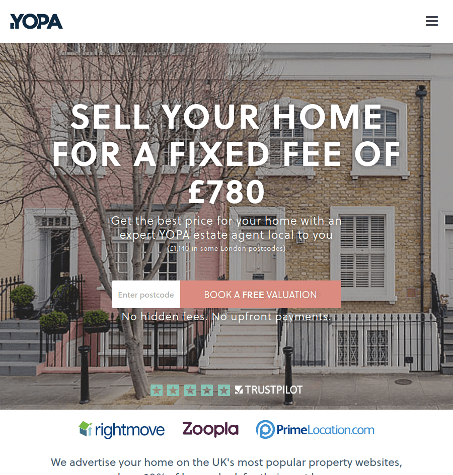
As a Copywriter, I obviously focus on the words but images and design are just as important. See the landing page from Yopa below, for an example of how all the different elements combine to create a killer landing page👇🏻

Humans can process and identify an image in as little as 13 millieseconds, according to Neuroscientists at MIT. When you consider that the average visitor spends less than 15 seconds on a website, capturing their attention is absolutely essential!
Make sure your landing page colour palette aligns with your branding. And always use a contrasting colour for the CTA button to make sure it pops. A bouncing arrow works well and serves as a directional cue and an anchor tag pointing down the page to the CTA.
8 steps to landing page success
If you want to create a killer landing page, follow the 8 steps below.
An attention-grabbing headline – Step 1
- Make it clear and relevant
- Capture the reader’s attention with a relatable question
Engaging imagery – Step 2
- Engaging imagery – images/multimedia
- Consider video
A compelling CTA – Step 3
- One/few CTAs
- Visibility – clear, it stands out
To-the-point copy in your brand voice – Step 4
- Use descriptive subheaders – aligned with other copy
- Short, concise, informative and customer-centric
- A clear offer
- Use brand storytelling with power words and emotional triggers
- Highlight benefits over features, show how your product/service solves the customer’s problems and how their future self will feel
- Strong grammar and spelling
A single defined goal – Step 5
- Understand the purpose and intention of your landing page – clear message and defined goals
- Customers come first – focus on the offer not who you are as a company. Speak and design for your target audience. Use You not I when you’re writing your landing page copy.
Unique Selling Point – Step 6
- What do you stand for?
- What makes your company, product or service different from your competitors?
Social Proof – Reviews/Testimonials – Step 7
- Customer feedback and support
- Credentials and promises
Optimized design – Step 8
- Make sure the landing page is in your brand colour palette
- Use white space to your advantage – spread out your content, and make it easy for customers to find your CTA
- Add brand personality but don’t overload
- Clean, simple, focused design
- Bullet point copy for a lighter design appearance
So, that’s how you create a killer landing page in a nutshell! And, if you’re ready to have a go at creating your own killer landing page check out my resources below!
Killer Landing Page Copywriting Toolkit
For a deeper dive, register your interest in my Killer Landing Page Copywriting Toolkit.

I also offer a Killer Landing Page Power Hour and provide done-for-you landing page copywriting services. Please get in touch to find out more! My email is annie@bijouconcierge.co.uk

